The Fig Cooking School
Brand Identity
The Challenge
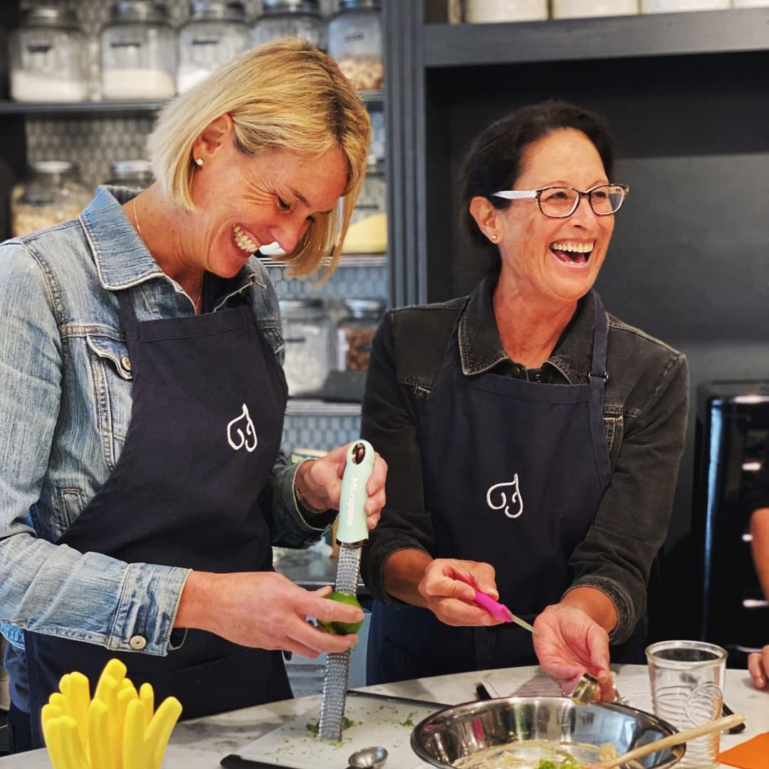
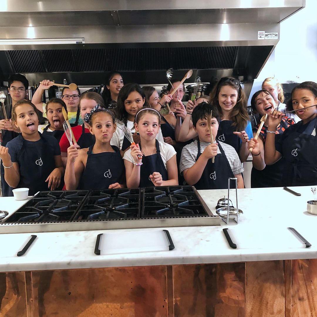
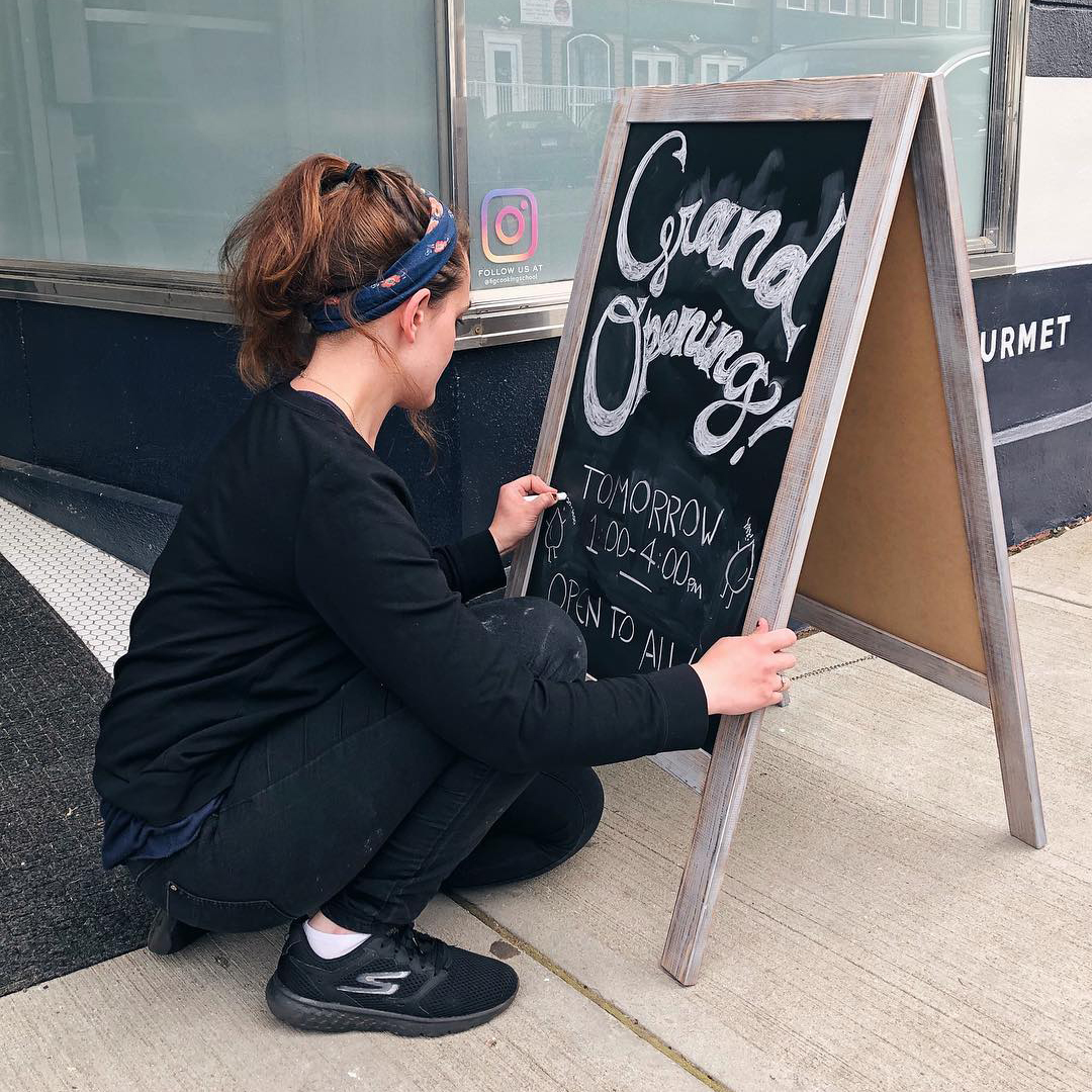
The Fig Cooking School is a gourmet cooking school bringing home cooks from Connecticut, New York, and Massachusetts together over amazing hands-on cooking classes. 7 years into their business, their original branding was growing stale and needed an update to reflect the sophistication and professionalism of the service they provide. In addition to a brand identity, they needed their essence distilled down the to most important attributes setting them apart from other regional cooking schools as they prepared for a move to a more prominent location.
Since Fig’s brand is a pure representation of its founder and owner, Chef Heide Lang, the identity needed to reflect her personality. The final book needed to be effusive, interesting, feminine, clever, consistent, and confident. It also needed to balance sophistication with an unintimidating warmth to reflect Fig’s universally welcoming environment.
Industry
Food & Beverage, Hospitality
Services Provided
Branding
Based In
Connecticut, USA
The Solution
While Fig’s flavors and lessons are unparalleled, what really sets it apart from other schools is its emphasis on welcoming everyone who comes through its doors, and bringing diverse groups together over food. With this focus in mind, we designed a brand suite that clearly represented Fig’s focus on quality, while incorporating playful elements and subtle symbols of welcoming to ensure that the school’s visual cues sell the experience and tell the brand story before guests even arrive.
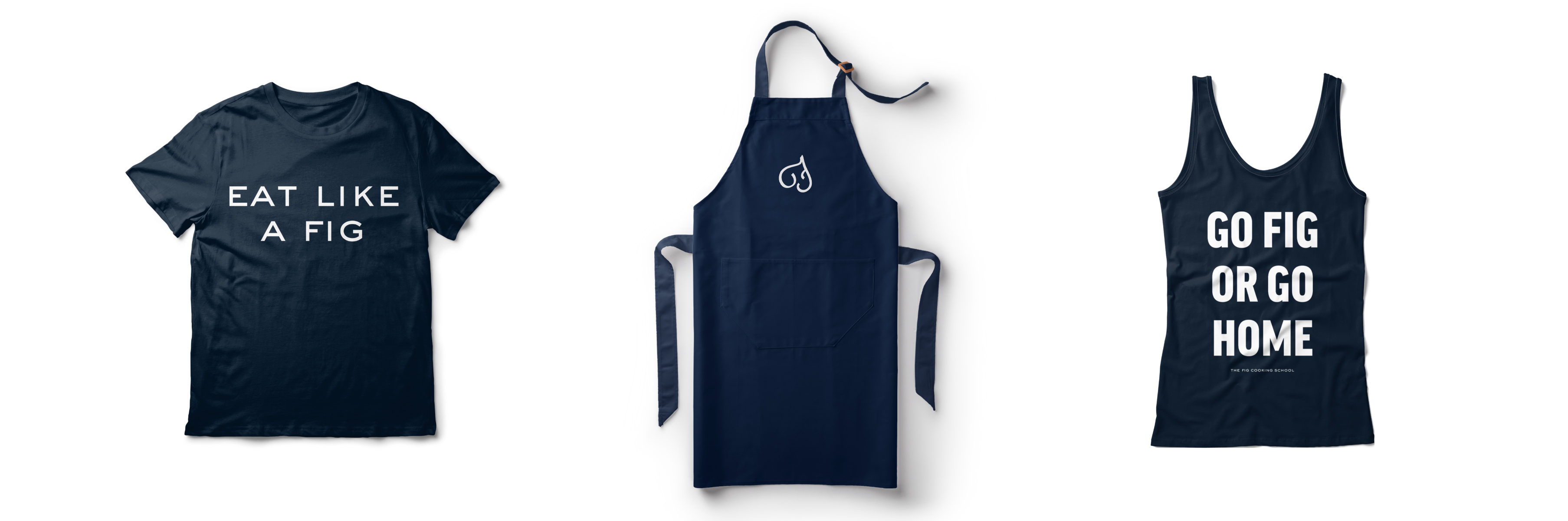
Logo
A swirling fig shape, adapted from Fig’s original logo to maintain continuity, is combined with a swirling cursive “F” glyph, to create a logo that captures not only the school’s name, but also its signature sleek, feminine, modern aesthetic.
Colors
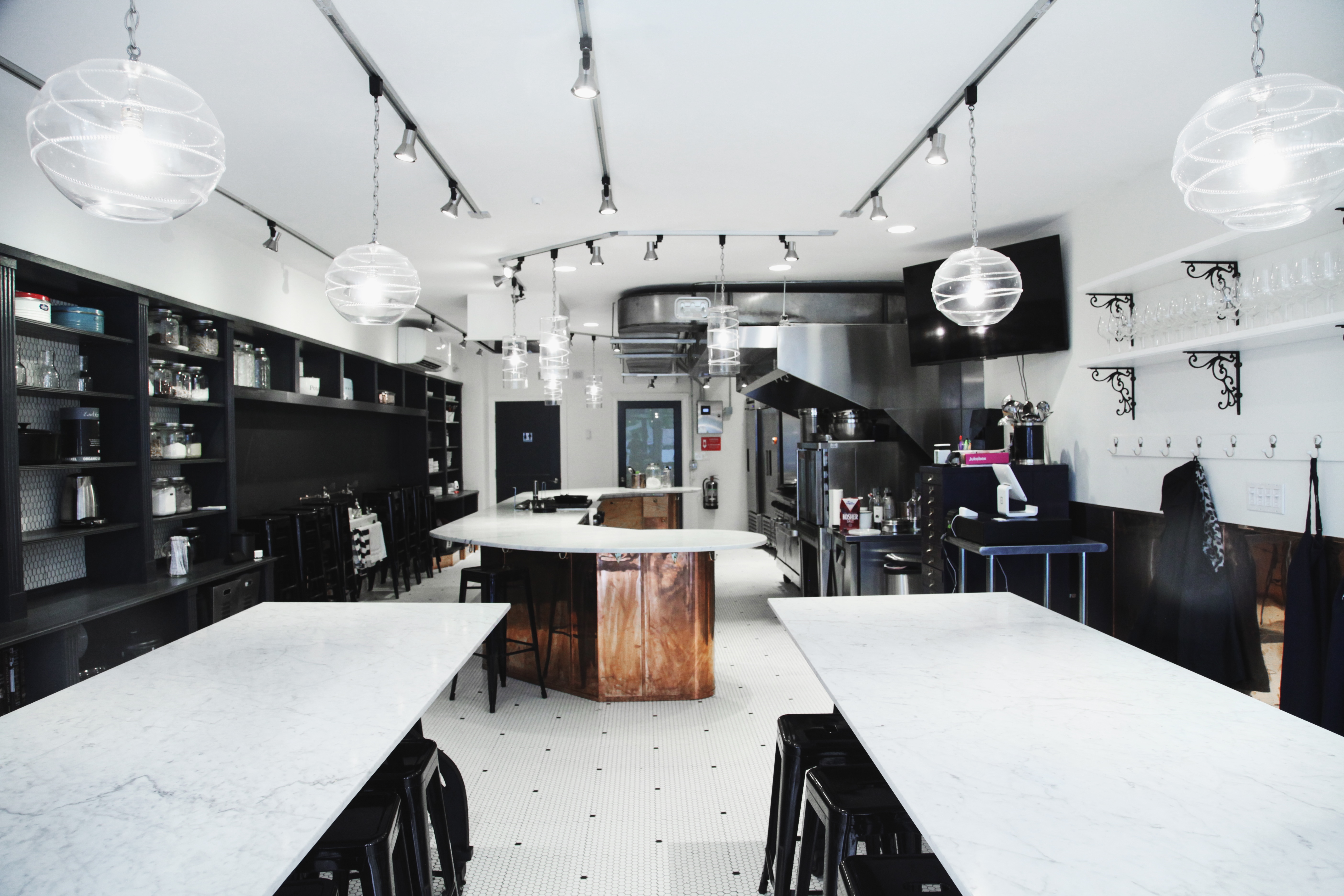
In keeping with Fig’s European-inspired interior design, the dominant color palette is navy blue and white, with copper accents. This quasi-neutral palette allows for thematic accent colors to be added and adjusted without compromising brand integrity.
Primary
Midnight Mission
Hex
#0D133A
RGB
R13 G19 B58
CMYK C100 M90 Y13 K71
Pantone Coated
PMS 2768C
Pantone Uncoated
PMS 2767 U
Primary
Copper Pot
Luxor
355 Foil
Pantone Coated
PMS 185 C
Assets CopperPot.jpg
Primary
White
Hex
#FFFFFF
RGB
R255 G255 B255
CMYK C0 M0 Y0 K0
Type
Primary headings are sleek, sophisticated and easy to read, while accent headings and logotype appear in a feminine European-inspired cursive. Delicate, contemporary body copy pulls the look together while maintaining legibility and strong UX throughout all Fig materials.
Heading 1
Aa Bb Cc Dd Ee Ff Gg Hh Ii Jj Kk Ll Mm Nn Oo Pp Qq Rr Ss Tt Uu Vv Ww Xx Yy Zz
1 2 3 4 5 6 7 8 9 0
Heading 2
Aa Bb Cc Dd Ee Ff Gg Hh Ii Jj Kk Ll Mm Nn Oo Pp Qq Rr Ss Tt Uu Vv Ww Xx Yy Zz
1 2 3 4 5 6 7 8 9 0
Subhead
A B C D E F G H I J K L M N O P Q R S T U V W X Y Z
1 2 3 4 5 6 7 8 9 0
Body
Aa Bb Cc Dd Ee Ff Gg Hh Ii Jj Kk Ll Mm Nn Oo Pp Qq Rr Ss Tt Uu Vv Ww Xx Yy Zz
1 2 3 4 5 6 7 8 9 0
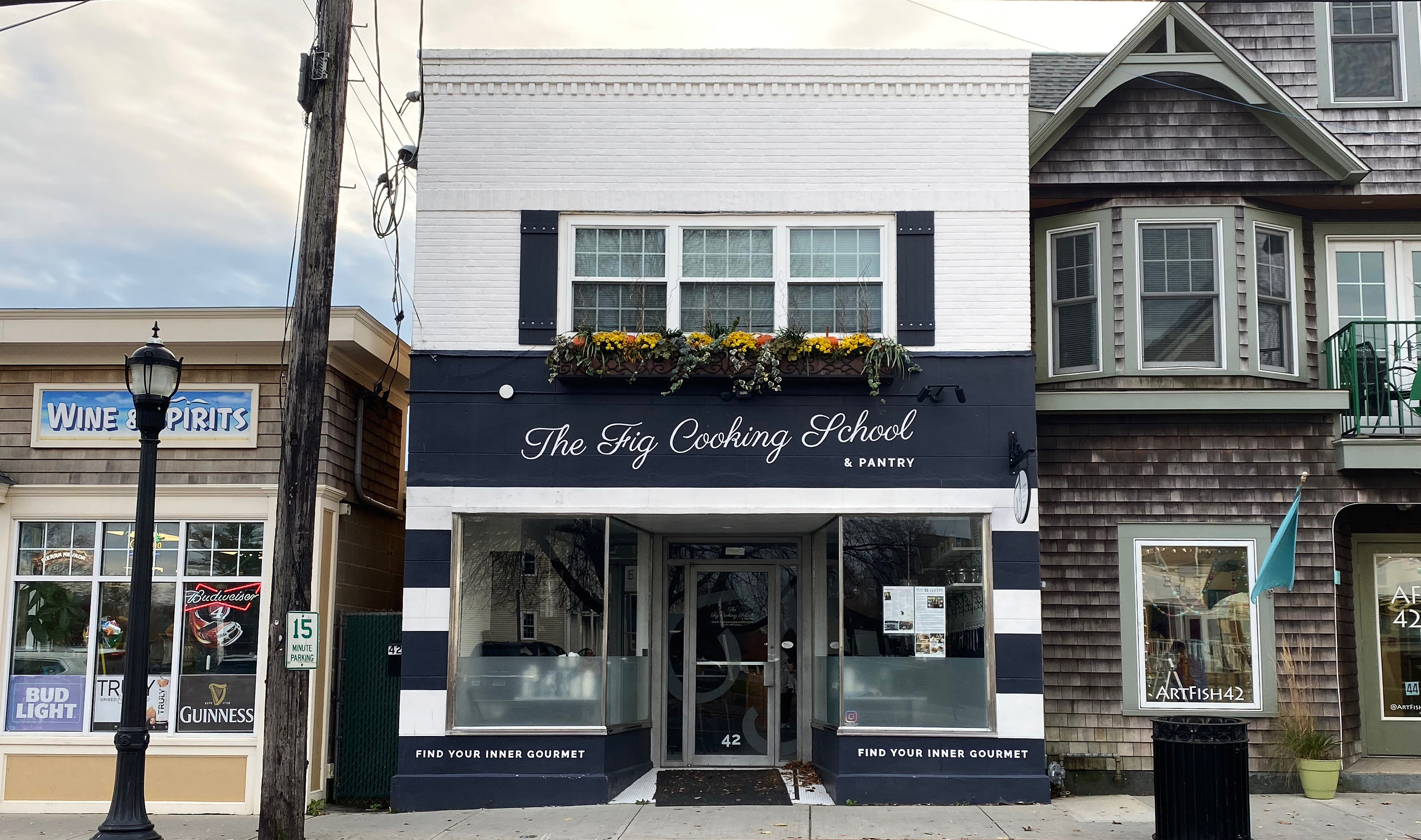
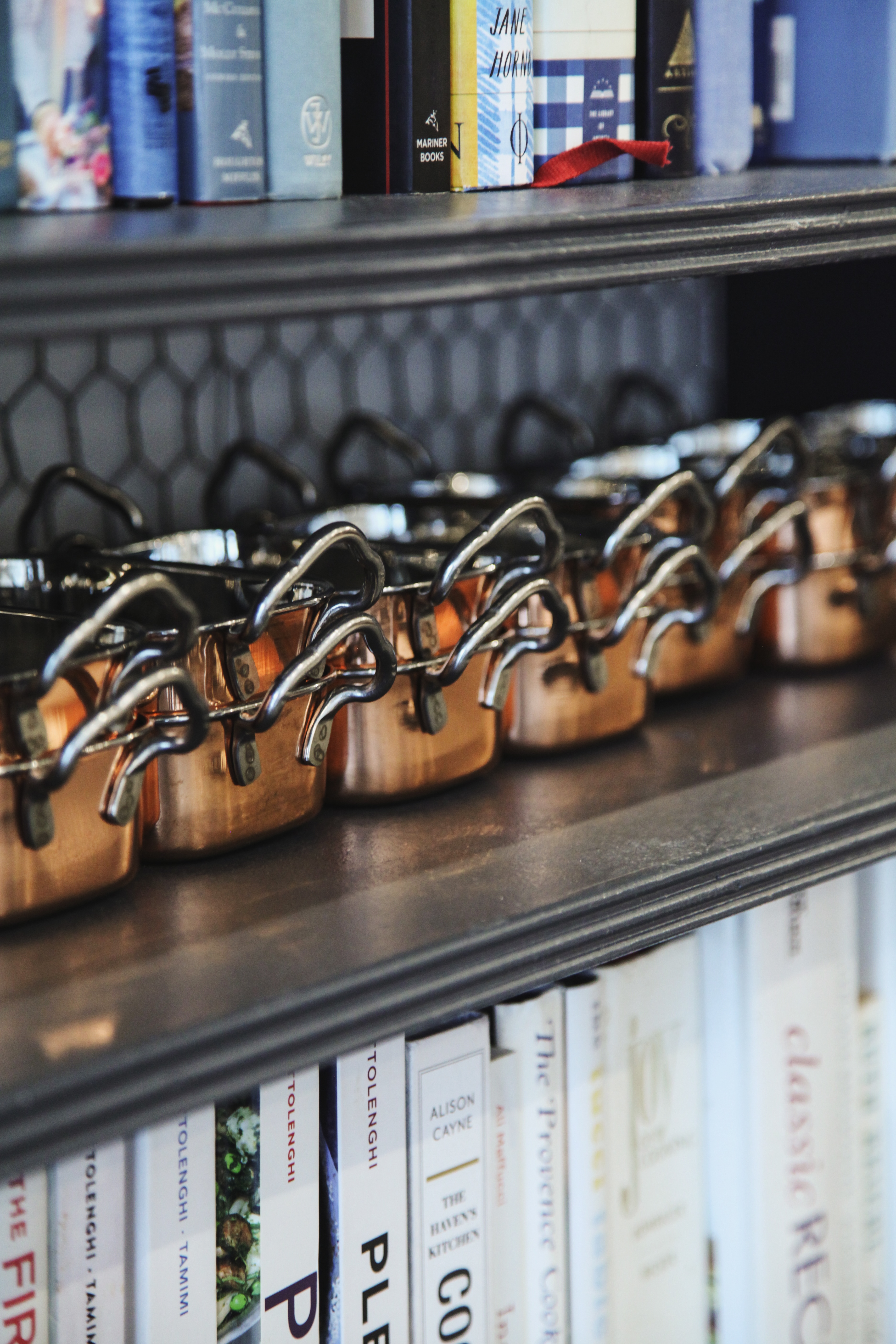
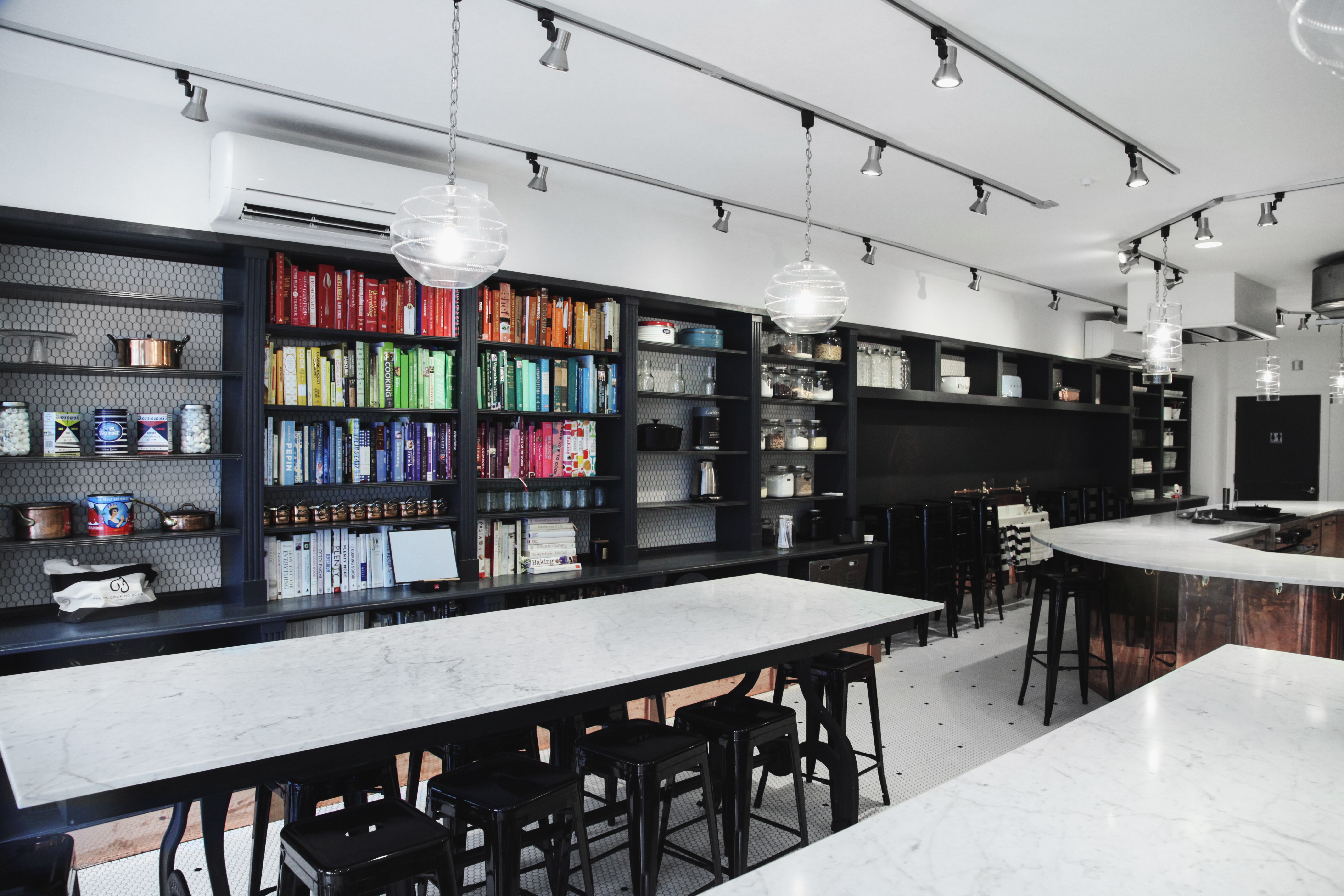
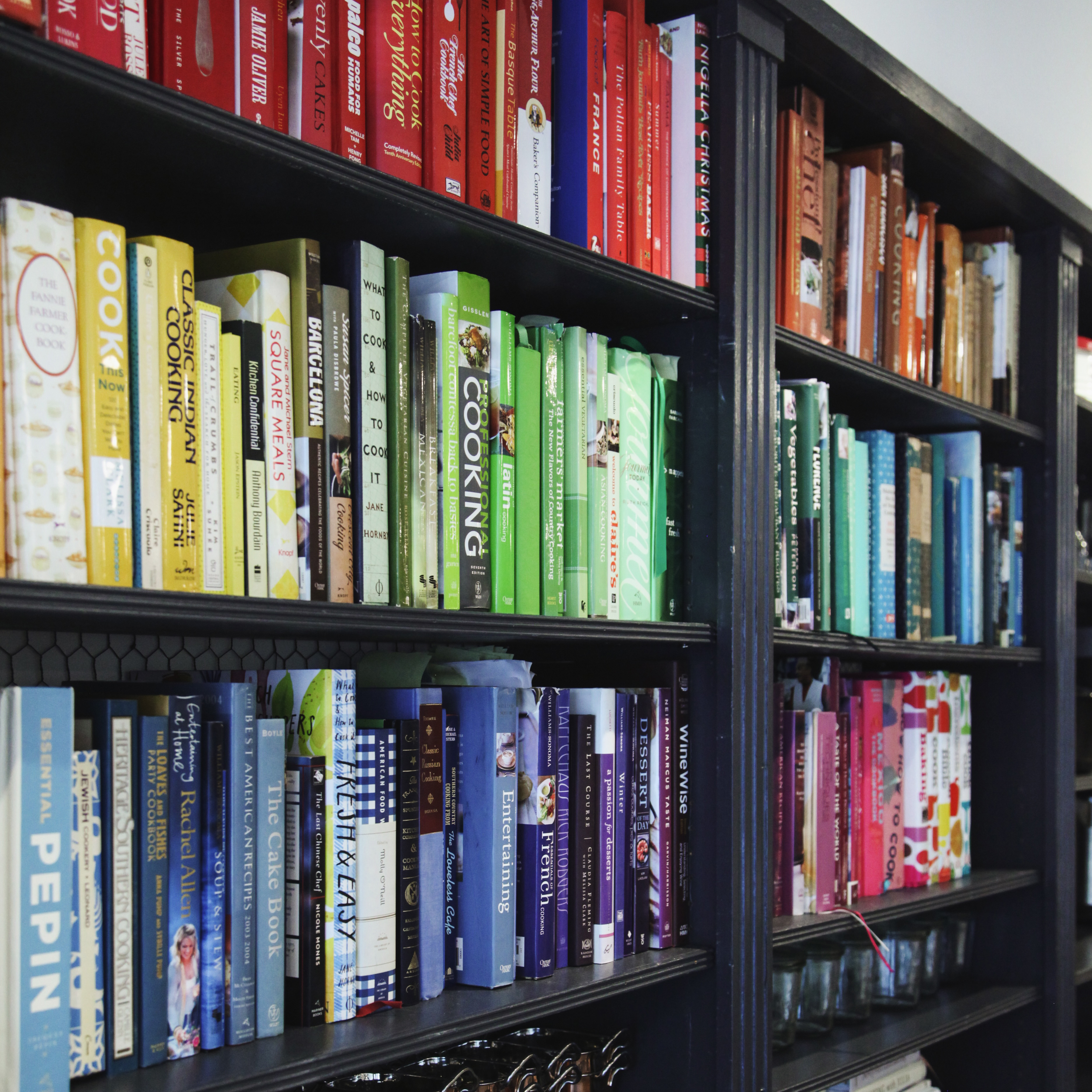
Design Motifs
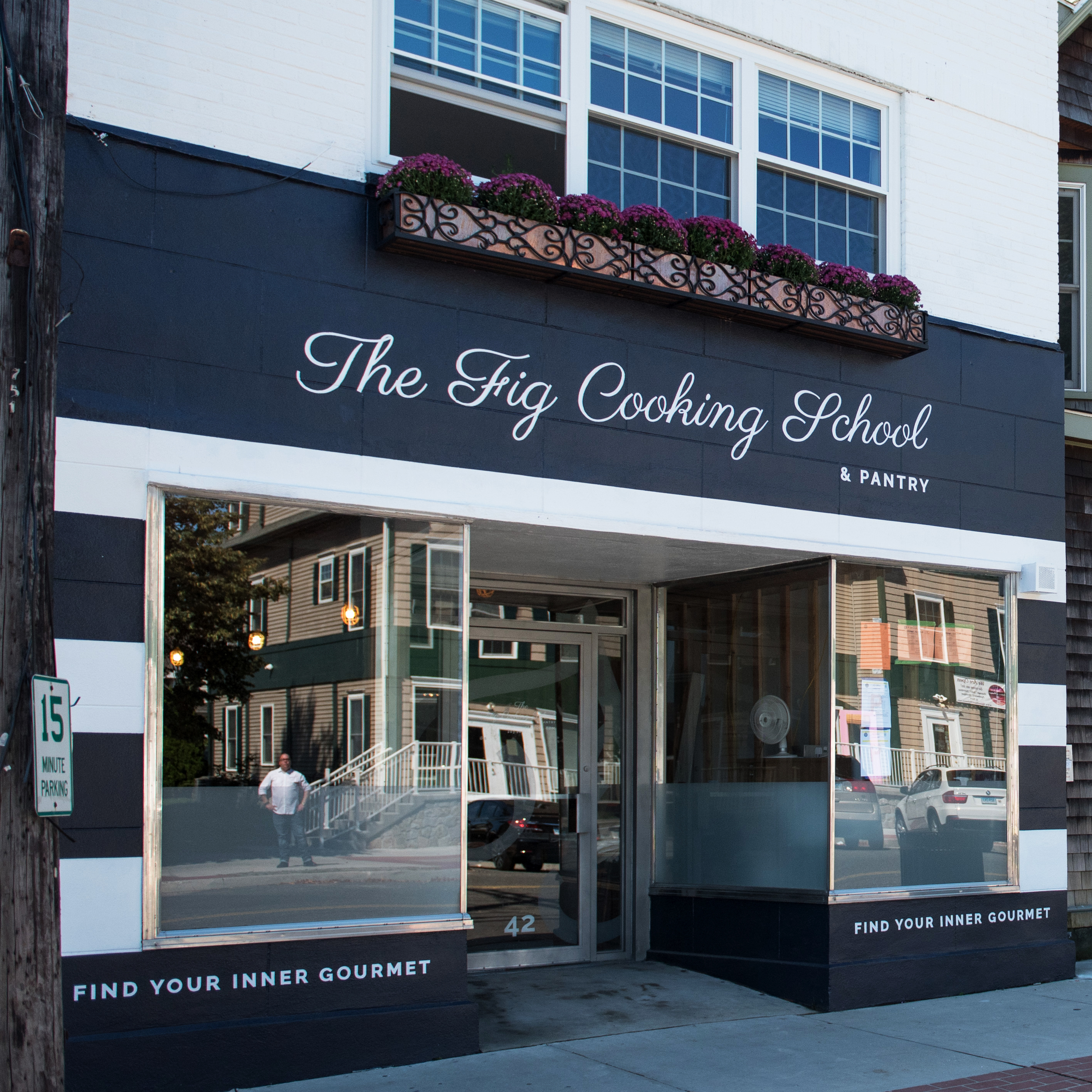
We use several design motifs to convey Fig’s mission immediately to new guests, both in marketing materials and in their physical studio space. The rainbow bookshelf is not only an attention-grabbing centerpiece, but a universal symbol of welcome to all who enter. The navy and white marinière stripes on the building exterior (which we also designed!) are inspired both by Chef Lang’s French training and the nearby beach, symbolizing Fig’s commitment to quality and to the community.
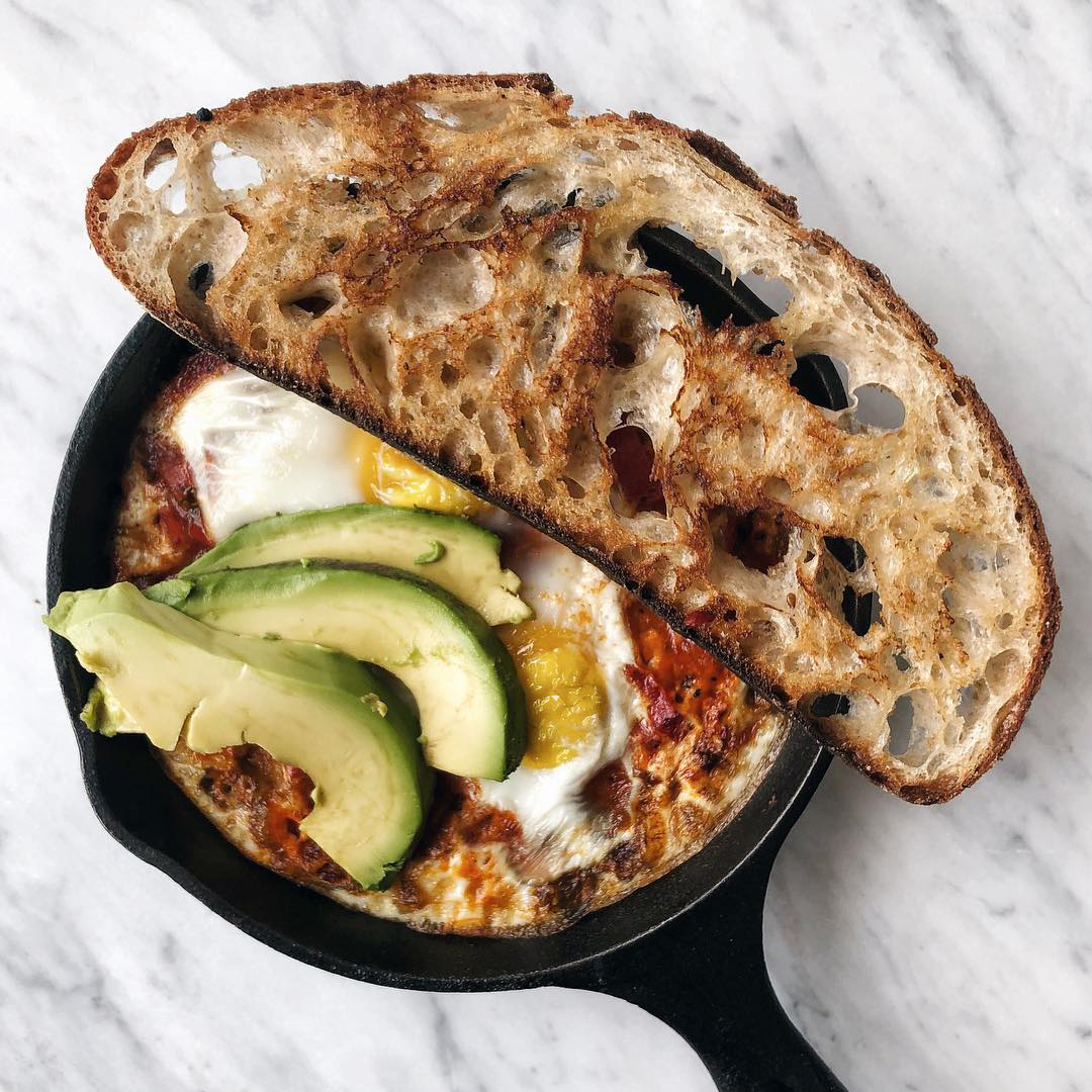
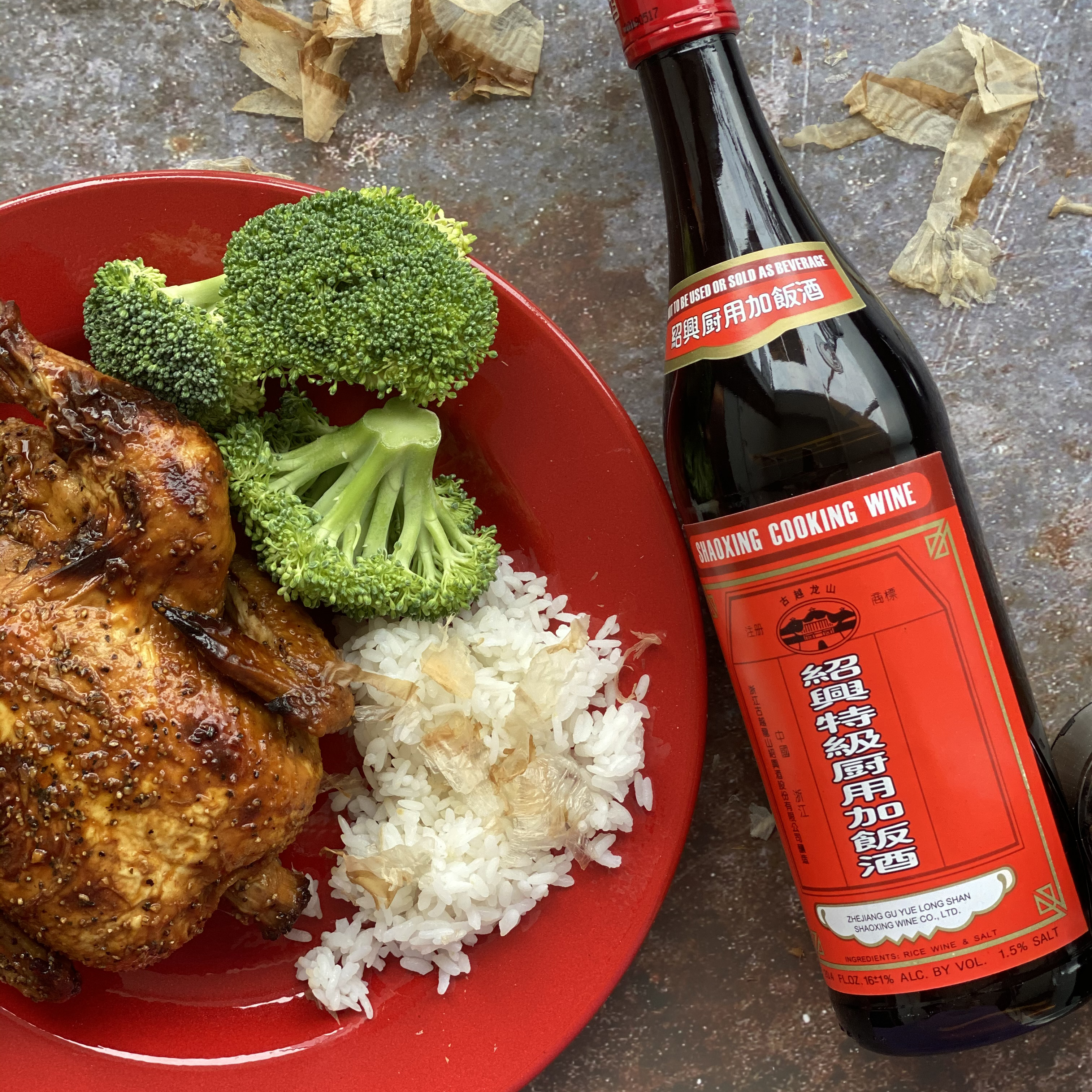
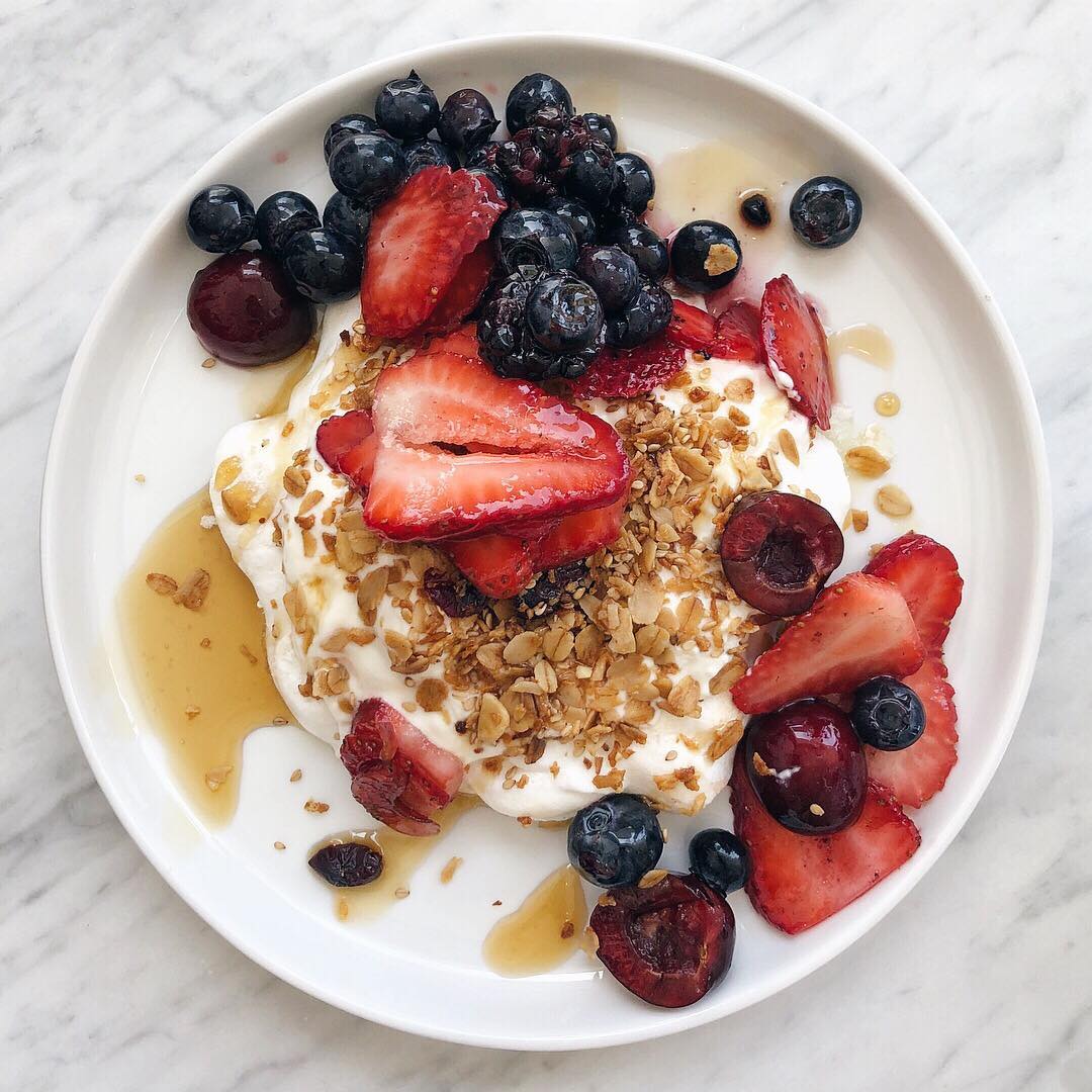
Social Media
A valuable venue for announcing important news, a window into the Fig experience, and a way to show off new recipes and culinary adventures, we developed a creative direction for the “Figstagram” (as it’s affectionately called) that emphasizes aesthetic consistency and dynamic content.