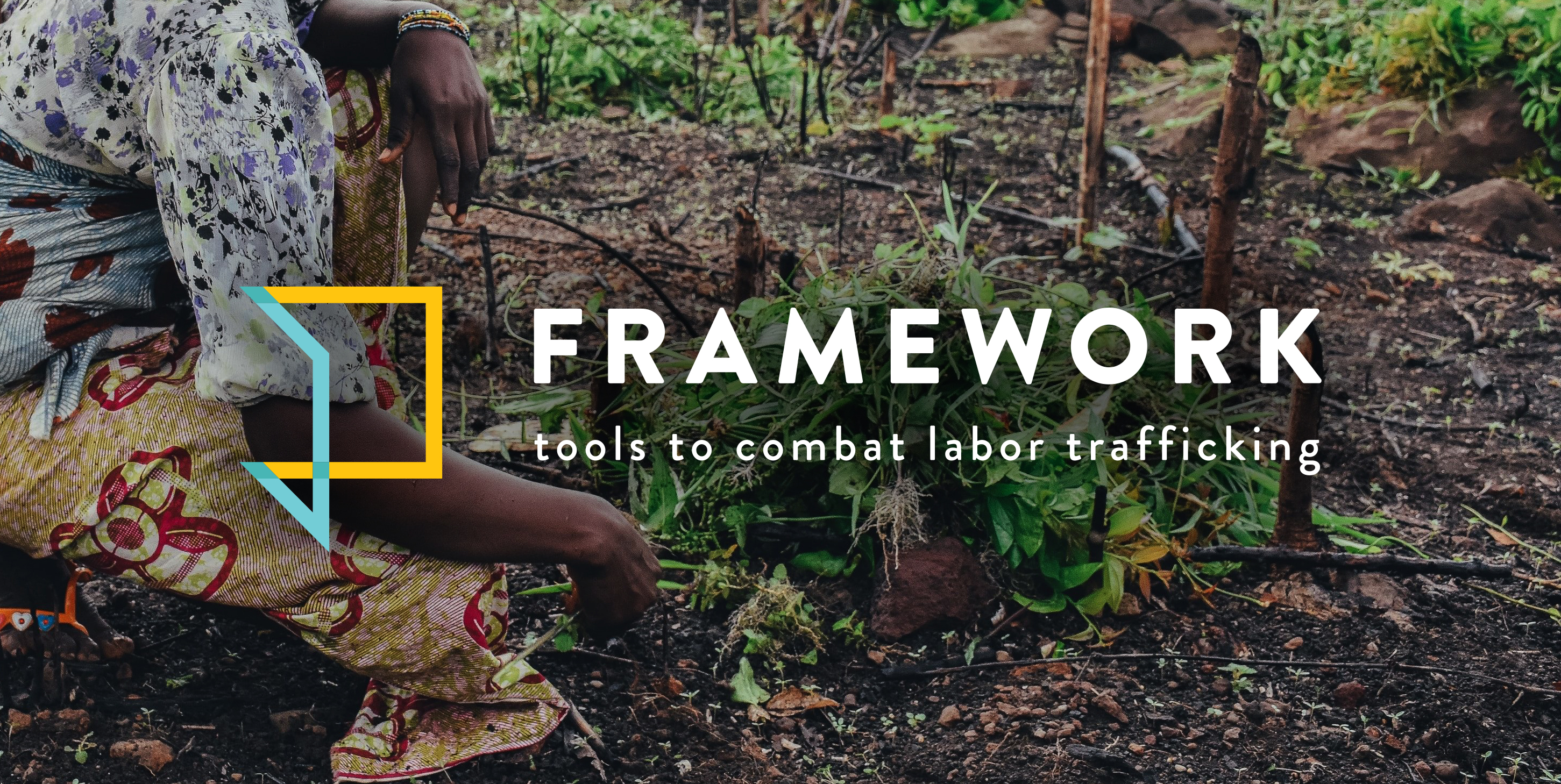
Framework
Brand Identity
The Challenge
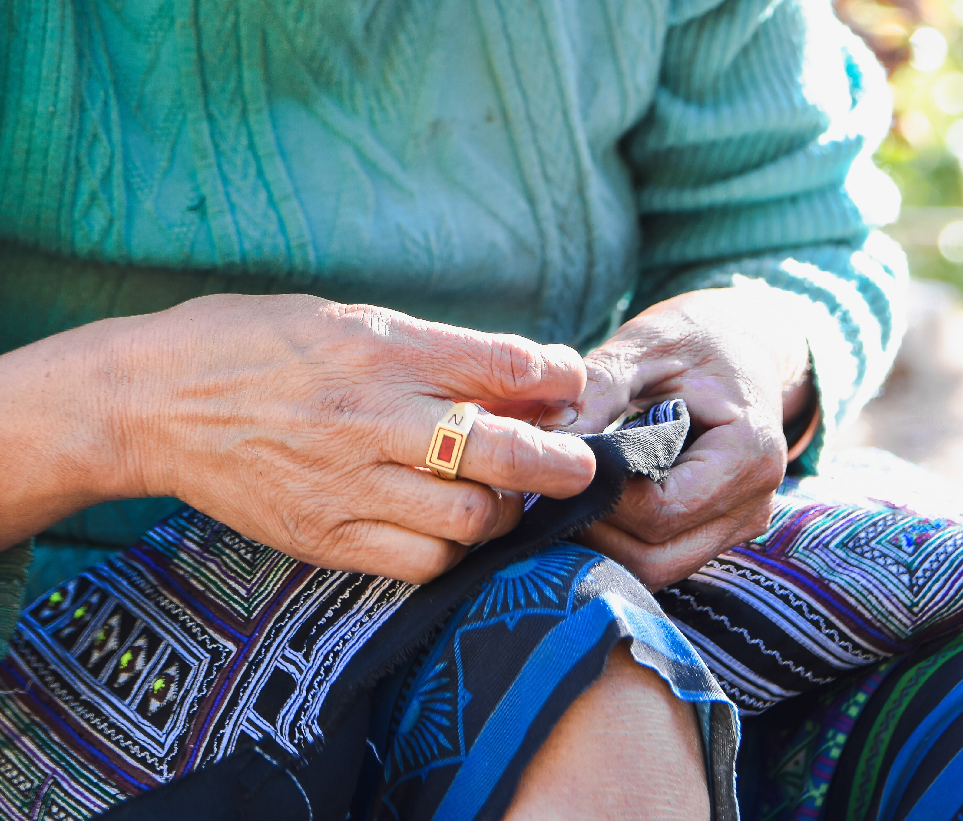
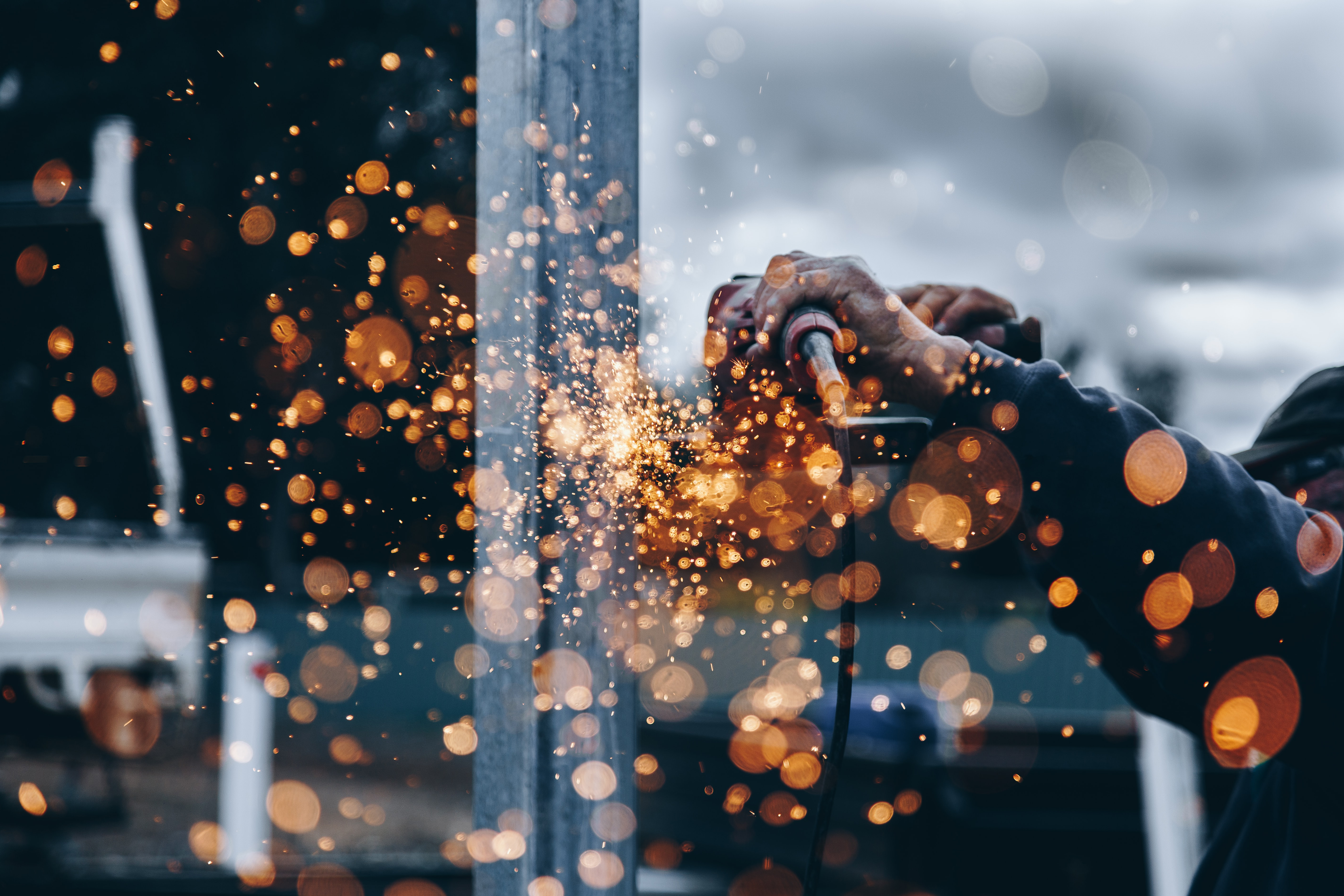
The International Rescue Committee was implementing a new, project funded by the Office for Victims of Crime providing free resources, training, and professional education for experts in the fight against labor trafficking. Unlike many nonprofit projects, this project would not be public-facing, but rather provided support for professionals to optimize their own efforts.
Created in the vein of similar projects, like Switchboard, this program needed a name and full brand suite that would would fit well among its peer projects, while setting it apart from standard nonprofit branding, and clearly representing its spirit and objectives. Visual branding also needed to clearly designate Framework, as its own project, separate from the distinctive branding of the IRC itself. Working closely with Framework’s team members and director, we developed a name, logo, distinctive color scheme, font scheme, and iconography to create unmistakable, and ownable branding for this important project.
Industry
Non-Profit, Labor Justice
Services Provided
Brand Identity
Based In
New York, NY
The Solution
The resources, support, and and direct education provided through this one-stop source are a structure on which labor trafficking experts can realize their organization’s specific goals. The tools come alive in the hands of the people who use them.
With this in mind, we crafted a name, logo, and color scheme that directly spoke to this function. The name Framework, paired with a flexible, open geometric logo and color palette inspired by CMYK imagery, directly represents the potential of this program for everyone who uses it, inviting them to build their own efforts out of the toolbox provided.
Name
At its core, this project is a structure upon which people can build their own goals. The name Framework alludes to that function, and includes the word “work” to ground it specifically in labor trafficking.
Since the name metaphorically represents project’s function, we developed “Tools to combat labor trafficking” as a straightforward tagline to make the exact nature of the project explicitly clear.
Logo
Using minimal lines to show the 3 dimensionality of a cube, but coming together in its own unique symbol, this logo symbolically represents Framework’s nature as a base on which visitors can build their own complete projects. This symbol also looks like an open door or book, representing an invitation to enriched knowledge. Finally, the abstraction of the lines in a square shape implies from an engineering standpoint that they can be creatively reconfigured, representing the many ways service providers can use Framework to suit their unique needs.
Colors
Framework’s function as a structure and toolkit extends through its color scheme as well. Cyan, Magenta, Yellow and Black (known colloquially as CMYK) are the true primary bases that can combine to form the full spectrum of colors we know. With this in mind, we crafted a proprietary palette based in this structure. To avoid detraction from the base colors by creating a full rainbow aesthetic, we created muted accents that reinforced the symbolism while providing depth for overlapping shapes. The final color scheme is bright, hopeful, professional and symbolic of Framework’s character and objectives.
We also worked with Framework's team to ensure that at least 3 color options – Black, Magenta 2, and Cyan 3 – met ADA requirements for high-contrast text legibility, so team members could create accessible text without creative limitation.
Primary
Cyan
Hex
#70d1d9
RGB
R112 G209 B217
CMYK C59 M0 Y14 K0
Pantone Coated
PMS 310 C
Pantone Uncoated
PMS 635 U
Primary
Magenta
Hex
#d42442
RGB
R212 G36 B66
CMYK C0 M100 Y72 K0
Pantone Coated
PMS 185 C
Pantone Uncoated
PMS 185 U
Primary
Yellow
Hex
#ffc400
RGB
R255 G196 B0
CMYK C0 M13 Y98 K0
Pantone Coated
PMS 7548 C
Pantone Uncoated
PMS 7405 U
Primary
Black
Hex
#383333
RGB
R56 G51 B51
CMYK C86 M70 Y69 K95
Pantone Coated
PMS 419 C
Pantone Uncoated
PMS Black U
ADA Text Compliant
Secondary
Cyan 2
Hex
#4db5b5
RGB
R77 G181 B181
Secondary
Magenta 2
Hex
#ab1c3b
RGB
R171 G28 B59
ADA Text Compliant
Secondary
Yellow 2
Hex
#e5a900
RGB
R229 G169 B0
Secondary
Cyan 3
Hex
#007d87
RGB
R0 G125 B135
ADA Text Compliant
Type
We symbolized Framework’s meaning by using simple, playful fonts that provided visual interest and inspired creativity, while still functioning as a base on which to build the user’s ideas. The contrast between the bold headline and light body text further reinforces the wide range of possibilities Framework provides.
Heading
A B C D E F G H I J K L M N O P Q R S T U V W X Y Z
1 2 3 4 5 6 7 8 9 0
Body
Aa Bb Cc Dd Ee Ff Gg Hh Ii Jj Kk Ll Mm Nn Oo Pp Qq Rr Ss Tt Uu Vv Ww Xx Yy Zz
1 2 3 4 5 6 7 8 9 0
Iconography
The flexible structure of the logo inspired this geometric iconography. Making full use of the CMYK aesthetic, minimalist illustrations are used throughout the site to distinguish resources and provide visual interest.
Donate to the IRC
Switchboard is implemented by the International Rescue Committee (IRC) which is is one of the most important and influential NGOs confronting today’s many humanitarian crises. Focusing on those whose lives have been torn apart by disaster, conflict, and displacement, they not only address urgent needs but also give those they help the power and tools to take control of their future. As protections for refugees are slashed both here and worldwide, the IRC’s mission has never been more important and with virtually perfect scores from all charity watchdogs, there is no organization we can think of more worthy of contribution. We invite anybody reading this to consider making a donation, however small or large, to the IRC’s mission. Thank you!
Donation button will redirect you to the IRC’s main site where you will have the opportunity to learn more about their mission and projects, and, if you desire, choose to make a donation in any amount you are able.